Showing posts with label webdesign. Show all posts

06 March, 2011

The Evil Twitter Twins

Back in September, Twitter began rolling out a sparkly new layout and a few new features to some of its users, and officially completed it in October. Users are still given the option whether to use "old" or "new" Twitter, and I'd personally kept to the old one for a while for a variety of reasons, including my typical resistance to anything my favorite services try to change for the sake of changing (if it ain't broke...) but also because of the "new" version's wider layout, which fills most of the screen horizontally.

Old Twitter

Old Twitter Width

New Twitter

New Twitter Width

The implication is that less of the user's background image will be showing. A little *ahem* background... on Twitter's backgrounds. You basically get three options when designing your Twitter profile's background appearance:

  • solid color (don't use a background image)
  • background image that tiles (repeats vertically and horizontally)
  • background image that doesn't tile and is stuck in the top-left corner of the screen
Twitter Profile Settings Screen

This is a bit different from normal Web pages, which allow you to set a variety of options in HTML and CSS such as whether the image will be centered or stuck to a different side of the screen, whether it will be fixed or scroll with the content, and more. To be fair, most social networks do limit customization in order to maintain some kind of consistency for the user experience. Twitter in particular has always had a very streamlined interface and sometimes an overly-simplified approach to its service. The great thing about getting millions of minds together online though, is that often people will come up with extremely cool ways to work within the provided framework and still show off their creativity.

In the case of Twitter, one of these ways was to create custom background graphics which either reinforced a brand image, pointed to other social networks (Twitter limits you to one hyperlink in your actual profile), or just looked darn cool. There are plenty of nifty "Twitter background" roundups and tutorials floating out there which highlight this trend, but they generally display the narrower layout which provided more real estate for these creative backgrounds.

Now, I had not taken the time to design myself a cool background before this point, and in a way I'm glad I didn't because it's a shame for all the people who did, only to have them hidden today. However, in light of the imminent "You’re using an older version of Twitter that won’t be around for much longer" message posted along the top of every page, I decided that there must be a way to have a cool-looking graphic that fits in the new space provided.

And so, in honor of Spring cleaning, my new MacBook Air, and the design community at large, I put myself up to the challenge.

Thought process:

  • I am not including mobile users, as they would be using mobile Twitter or a third-party application, so they wouldn't see any change in "layout" from old to new or any user's backgrounds at all.
  • For some users, 1024px is the highest resolution their screens will allow. Browsing new Twitter with a 1024px wide window on a normal device, though, means that you have 40px of background real estate on the left, and 40px on the right. Unless you're going to write something at 4pt font size or place your favicon there, I don't see this as being useful. It is practically the smallest resolution you can use in the new Twitter before getting horizontal scrollbars (ick), so I think it's safe to say this resolution will not be our target.
  • Moving on to the next big class of users: 1280px wide screens. Realizing that someone could resize their window a bit smaller even when their maximum resolution was 1280px meant that I wanted a design which could hold up to somewhere between 1024 and 1280, but generally 1280 would become the new standard. This gave me 120px to play with on each side of the screen.
  • The right sidebar in the new Twitter is now slightly transparent. I could do something cool behind there...

Time to sit down and design. Approximately three hours, one drunken roommate, some Pad Thai, and a few bathroom breaks later, I was finally satisfied enough to test my design...

Eureka! The Twitter Twins are Born

Eureka! It worked! My design didn't call for any specific top padding, and I eventually trimmed it down a bit, but I was very happy with how this looked online, how it scaled with the window, and of course, how very "Amy," my new Twitter background was.

Now off to write a how-to reference for the design community on http://color-and-code.com

28 July, 2010

Portfolio Update: JavaScript, CSS, JSON in Action

The inspiration for this portfolio is a brick-and-mortar (or in my case, probably plaster and peeling paint?) art gallery. I was going to go with something that scrolls left and right as if you are walking through, but it felt so... constrained... contrived... limiting. For a portfolio piece, I really wanted something that showcased both my technical knowledge and graphic skill. So I broke out of the shell a bit with this one and made an original mashup of some leading web technologies combined with my own need for an easy-to-edit showcase of my creative work.

Try resizing your browser window and see what happens. Also try dragging some of the artwork around.

An original portfolio design

Now for some technical mumbo-jumbo. Rather than a lightbox for image enlargements, I used a mid-size image to start. I kept it simple and linked to the image's Flickr page which also allows commenting, favoriting, viewing full size etc. for further interaction with the same number of mouse clicks. The page uses Flickr's API to pull my most interesting images from my photostream (JSON), then gets their title and puts it in the little caption area. The rest is some CSS and jQuery magic. The result is I always have an updated, interesting portfolio page which saves me precious time and energy!!! The downside is that with JavaScript disabled there isn't much to see. Note to self: come up with a creative static portfolio asap.

Let me know how you like it in the comments.

15 February, 2010

Homepage Redesign

My headfirst dive into web design began in high school, with a custom Myspace layout and a primitive "blog" at Xanga. After transferring to Temple University and taking our required Computer and Information Science (CIS) course, I created my first homepage. But as I am looking forward to graduation, I realize that Temple won't continue to host my webpage on their servers, and honestly I'm not even sure if they will let me use my @temple.edu e-mail address anymore, but that's another topic...

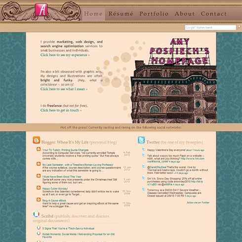
With this in mind, I purchased the domain name amypospiech.com and a hosting package, but then the question in my mind was, "what the heck do I put up there?" It was actually quite intimidating at first - with no limits on what I could do creatively or technically, I spent a few months just sketching ideas and keeping notes of things I liked on other portfolio sites and personal pages, as well as business sites and blogs. I then scrapped it all, came up with a totally original theme, added in some signature Amy style and at long last came up with this:

My new website!

I designed the theme around my favorite (abandoned) building in Philadelphia, the Divine Lorraine Hotel. It was built as an apartment complex in the late 19th century in a French Renaissance style, transformed into a hotel in 1948 under Father Divine and the Peace Mission Movement, and closed in 1999 when it was sold to developers (and subsequently re-sold for a hefty profit, but nothing to show for it yet). You can read about it here.

Knowing me, I will probably change this a few times a year (ha, ha) because after looking at something for too long, I get the crazy urge to go back and redo it all again. However, if anyone has suggestions for improvements, I'm all ears!

17 December, 2008

I've Matured (as a web designer)

Maybe I haven't, but my blog has definitely grown up over the past year+ that I've been blogging. Check out this blast from the past layout that I created back in the day, before the current one:

Old blog layout circa November 2007

Let me know what you think of the updated look!

pollcode.com
What do you think of the new layout?

Great! It was time for a change.
It's nice.
Less pink is a good thing.
I don't see the difference.
The old one was nice enough.
I liked the old one better.
Molto bello!
It's alright.
Very slick, modern looking.
Prettyyyy.


25 November, 2008

Kodak Moments: Have they disappeared?

In my technology in marketing class this semester, we've been discussing social media and how companies can use this new platform to build their brands and relationships with consumers. My group did a breast cancer awareness plan for the Susan G. Komen for the Cure football game/fundraiser back in October, and a social media plan for the Kodak brand last week.

Our big idea for Kodak was to revitalize the brand by building on the "spontaneous" factor of a Kodak Moment. Our viral marketing would center around a "Make this Your Moment" contest encouraging uploads to the online photo-sharing service. Video clips of faceless characters in humorous situations would be propagated around the web to drive traffic to the contest site.

Here's the PowerPoint we presented to the class (some weird buggy things happened while uploading online, though):

Kodak Moments: Social Media / Rebranding Proposal for an Old Favorite

Social Media Plan for Kodak by Jared Fink, Justin Goh, Sean McCulley, & Amy Pospiech Our Goal Today • Discuss the Kodak brand and discuss how it is currently perceived in the minds of consumers • Re-introduce the “Kodak Moment” • Discuss challenges and opportunities in leveraging this brand equity • Reveal the proposed Kodak Moments Social Media Campaign Background: The idea of a “Kodak moment” dates back to 1888, when George Eastman put the first simple camera into the hands of consumers. Our social media plan will revitalize this idea of an unexpected moment captured by an amateur photographer on film, using a buzz marketing campaign urging users to “Make this Your Kodak Moment.” What is Kodak now? • Kodak is known for its ease-of-use. With its Kodak EasyShare camera and PerfectTouch photo processing, it is aimed at the novice or busy individual. Even the essence of a “Kodak moment” is captured by this quick, even spontaneous theme. Brand Model: Old A Kodak Moment is… • An event for which you or someone wished someone nearby had a camera to take a picture. “When we went to the zoo Amanda fell into the gorilla cage. It was such a Kodak moment!” by kalley treay Jul 3, 2007 • A rare, one time, moment that is captured by a picture, or should have been captured by a picture. “Aww!.. They look soo happy sitting there by the lake! That's definetly a kodak moment!” by LiL' LAdY Nov 3, 2006 • Said when something funny happens Creative Consulting Current Web Presence: Snapshot • “Leading online digital photo developing service” • Secure and easy way to view, store and share photos with friends and family • Free editing and creative tools and specialty photo products • Similar to all other online tools Current Web Presence: A Thousand Words Blog • “What’s a picture worth?” • Off-brand, too general • Recent posts include topics as varied as pumpkin carving (incl. hardware tips), a flower photography class, and the end of a NASCAR sponsorship • Should be kept internal Current Web Presence: PluggedIn Blog • “A blog about Kodak products and customers” • Niche market (tech-y consumer) with a general description – needs better targeting • According to Technorati, the blog is ranked 150,646 and has an authority of 43 (in other words, 43 other sites have linked to it) Snapshot: Current Web Presence • Podcasts Twitter Facebook Youtube Flickr Delicious Professional Perceptual Map Cluttered Streamlined Amateur Moments Kodak Moments’ Target Audience • Those who remember the magic of the unexpected, spontaneous Kodak moment • Those old enough to appreciate the idea that life is fleeting, and have little time to preserve their moments through competitor’s cluttered, complicated websites • Those who appreciate a tactile experience like flipping through a photo album Brand Model: New Proposed Web 2.0 Presence Contest Details: “Make this Your Kodak • In order to create a buzz throughout our target market we are promoting a contest using short video clips • These clips will be distributed throughout the web on social networking sites • The winner of the contest will win a vacation tour of Italy were they can make of hilarious as well as special Kodak Moments Make this Your moment Online Ad Placement Mobile Marketing Make this Your moment Conclusion • Through the use of various social media channels, we will reinvent the Kodak brand image with Kodak Moments. • KodakMoments.com will touch the hearts and souls of the target market when they relive passionate still shots in a warming virtual atmosphere. • KodakMoments.com will simplify the online photo experience. Thank you

Ironically, Kodak had another agency come up with a similar idea about a month ago: Make Me Super. This site was created by an ad agency called EVB, owned by Omnicom Group. In reality, their idea is remarkably similar to the "Elf Yourself" OfficeMax campaign, and a lot like the earlier yearbookyourself site which inspired this series of Facebook photos (and our own project):

However, the Make Me Super project seems to lack that defining brand mark. That thing which makes Kodak, Kodak. Where have all the moments gone?

You can hear the entire presentation via a class capture of our group for as long as Temple keeps it up. Hope this isn't any type of privacy violation, haha. As far as I know, this is publicly available content. Anyway, enjoy.

24 November, 2008

Chaos and Convergence

So I don't know if it's because I'm now more aware of this social media craze, or if it actually is growing (at an insanely exponentially ridiculous rate), BUT:

  1. I'm now Tweeting. Follow me?
  2. Facebook has become standard lingo - I'm almost sick of hearing the word, especially in the context of, "let's create a facebook group to get people to love us!" Ho-hum.
  3. I've found so many blogs with interesting content, and even more that rip that content and re-post on their own blogs (with a credit link, of course), and so many tools to "sort through the clutter" that even the tools themselves are starting to add clutter to my life (StumbleUpon, Delicious, TweetDeck, FriendFeed, Google Reader, meta tags) ahhh!
  4. Ideas are being propagated, mashed-up, mish-moshed, re-syndicated, and re-created faster than you can find out where it even came from in the first place.

More on this in the next post.

09 November, 2008

International Business Association (IBA): Director of Web Development (and more)...

Check out the work I've been doing lately for Temple's International Business Association... I was appointed webmaster for the semester and have been doing a lot of other oddjobs as well, including research/designs for getting coffee mugs and tee shirts printed with our logo.

The current IBA website is based on an archaic version which was used in the past. The entire site is essentially one graphic, with text overlapping in various places and poor coding. Not to mention the misspelling "Philidelphia" in the footer of every page:

The revamped,browser-friendly website looks like this:

It is updated with a Google Calendar on the "Events" page, a new membership application form, PayPal links for paying member dues, and more.

We're working on a whole new design with green as an accent color to generate the idea of a map or globe. This might change but it's a start. The design uses CSS so it loads quickly in most browsers.

24 October, 2008

Stumbled Upon: Jackson Pollock

(Two posts in one day, oh boy!)

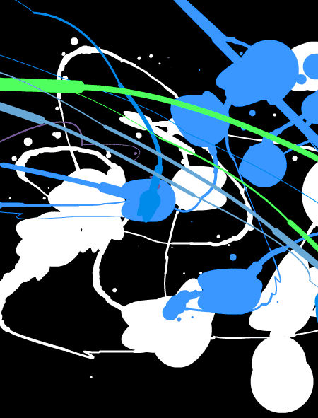
Just signed up for a service called StumbledUpon, which lets you find cool things on the internet based on your interests and likes / dislikes (via a browser toolbar). So I clicked that I like art, graphic design, and other typical things. And the first page I was taken to was blank. "Huh? Stupid service," I think.

Until I moved my mouse around on the page!!!

Jackson Pollock Art

Coooooooooool. Hey ya know what I like most about this? No one's trying to make any money, lol.

So I'm not sure if this is a post about StumbledUpon, Jackson Pollock, art, or the fact that the web is so cluttered with money-making schema, but enjoy. And have a good weekend!

Follow this blog - it's easier than stalking and less creepy