Learning about real photography and playing with a borrowed Canon EOS 400D and Camera RAW format in my newly-found free time! I put this in the category of "continuing education." Maybe it will help with a client project one day, hehe. The real story is that I had my carpets cleaned last week so I put my shoes up on my window sill and I thought they looked just lovely up there so I had to snap a few shots before taking them down. If I decide to take them down at all...
28 June, 2011
15 June, 2011
The Making of "Mr. Nouveau"
This time-lapse video compresses more then 4 hours of drawing into about 5 minutes. If only I could draw this quickly! I actually had a more aggressive vision in the beginning, as you can see I already sketched and began coloring two lion-looking figures (would be a leopard and her cub if I added the spots). I suppose as the saying goes, Rome wasn't built in a day, and I certainly couldn't spend more than that on these drawings. Adding it to the bucket of unfinished projects, for a rainy day...
In the meantime, I envision this graphic being printed on the back of a set of playing cards. Any takers?
08 June, 2011
My Contribution to Drawing Day 2011
This year's Drawing Day occurred on Saturday, June 4, and I was determined to participate. I called off social engagements, locked myself in my room, and stayed off facebook for an entire weekend. Well, for a few hours at least. As a result of this, I am pleased to introduce to you Mr. Nouveau, a very friendly peacock I drew over the course of a few days, first on plain paper, then on my graphics tablet. I don't get to use that thing nearly enough.

My photo reference was taken at my sister's graduation party a few weeks ago at Grounds for Sculpture in Trenton, NJ. I will post some of the pictures from that day soon as well.
About Drawing Day: One day a year, the world stops to remember that joy we had when we first picked up a pencil and created our first piece of art - that's what Drawing Day is all about. The goal for Drawing Day is simple - to create enough drawings to make some noise worldwide for the sake of art.
- http://drawingday.org/
06 March, 2011
The Evil Twitter Twins
Back in September, Twitter began rolling out a sparkly new layout and a few new features to some of its users, and officially completed it in October. Users are still given the option whether to use "old" or "new" Twitter, and I'd personally kept to the old one for a while for a variety of reasons, including my typical resistance to anything my favorite services try to change for the sake of changing (if it ain't broke...) but also because of the "new" version's wider layout, which fills most of the screen horizontally.
Old Twitter
New Twitter
The implication is that less of the user's background image will be showing. A little *ahem* background... on Twitter's backgrounds. You basically get three options when designing your Twitter profile's background appearance:
- solid color (don't use a background image)
- background image that tiles (repeats vertically and horizontally)
- background image that doesn't tile and is stuck in the top-left corner of the screen
This is a bit different from normal Web pages, which allow you to set a variety of options in HTML and CSS such as whether the image will be centered or stuck to a different side of the screen, whether it will be fixed or scroll with the content, and more. To be fair, most social networks do limit customization in order to maintain some kind of consistency for the user experience. Twitter in particular has always had a very streamlined interface and sometimes an overly-simplified approach to its service. The great thing about getting millions of minds together online though, is that often people will come up with extremely cool ways to work within the provided framework and still show off their creativity.
In the case of Twitter, one of these ways was to create custom background graphics which either reinforced a brand image, pointed to other social networks (Twitter limits you to one hyperlink in your actual profile), or just looked darn cool. There are plenty of nifty "Twitter background" roundups and tutorials floating out there which highlight this trend, but they generally display the narrower layout which provided more real estate for these creative backgrounds.
Now, I had not taken the time to design myself a cool background before this point, and in a way I'm glad I didn't because it's a shame for all the people who did, only to have them hidden today. However, in light of the imminent "You’re using an older version of Twitter that won’t be around for much longer" message posted along the top of every page, I decided that there must be a way to have a cool-looking graphic that fits in the new space provided.
And so, in honor of Spring cleaning, my new MacBook Air, and the design community at large, I put myself up to the challenge.
Thought process:
- I am not including mobile users, as they would be using mobile Twitter or a third-party application, so they wouldn't see any change in "layout" from old to new or any user's backgrounds at all.
- For some users, 1024px is the highest resolution their screens will allow. Browsing new Twitter with a 1024px wide window on a normal device, though, means that you have 40px of background real estate on the left, and 40px on the right. Unless you're going to write something at 4pt font size or place your favicon there, I don't see this as being useful. It is practically the smallest resolution you can use in the new Twitter before getting horizontal scrollbars (ick), so I think it's safe to say this resolution will not be our target.
- Moving on to the next big class of users: 1280px wide screens. Realizing that someone could resize their window a bit smaller even when their maximum resolution was 1280px meant that I wanted a design which could hold up to somewhere between 1024 and 1280, but generally 1280 would become the new standard. This gave me 120px to play with on each side of the screen.
- The right sidebar in the new Twitter is now slightly transparent. I could do something cool behind there...
Time to sit down and design. Approximately three hours, one drunken roommate, some Pad Thai, and a few bathroom breaks later, I was finally satisfied enough to test my design...
Eureka! It worked! My design didn't call for any specific top padding, and I eventually trimmed it down a bit, but I was very happy with how this looked online, how it scaled with the window, and of course, how very "Amy," my new Twitter background was.
Now off to write a how-to reference for the design community on http://color-and-code.com
28 July, 2010
Portfolio Update: JavaScript, CSS, JSON in Action
The inspiration for this portfolio is a brick-and-mortar (or in my case, probably plaster and peeling paint?) art gallery. I was going to go with something that scrolls left and right as if you are walking through, but it felt so... constrained... contrived... limiting. For a portfolio piece, I really wanted something that showcased both my technical knowledge and graphic skill. So I broke out of the shell a bit with this one and made an original mashup of some leading web technologies combined with my own need for an easy-to-edit showcase of my creative work.
Try resizing your browser window and see what happens. Also try dragging some of the artwork around.
Now for some technical mumbo-jumbo. Rather than a lightbox for image enlargements, I used a mid-size image to start. I kept it simple and linked to the image's Flickr page which also allows commenting, favoriting, viewing full size etc. for further interaction with the same number of mouse clicks. The page uses Flickr's API to pull my most interesting images from my photostream (JSON), then gets their title and puts it in the little caption area. The rest is some CSS and jQuery magic. The result is I always have an updated, interesting portfolio page which saves me precious time and energy!!! The downside is that with JavaScript disabled there isn't much to see. Note to self: come up with a creative static portfolio asap.
Let me know how you like it in the comments.
20 April, 2010
A short story: Great Leaps for Susan
Suzie leaped across the rooftop, flailing her arms beneath a long green cape and landing precisely on the building opposite, the silky “S” stitched into her leotard glimmering in the sunset. She dared look behind her to stare in the face of her enemy: a plastic headless Barbie doll named Midge.
“Susan, get down here and help set the table for dinner,” mother interrupted from the bottom of the stairway, “It’s almost 6 o’clock already.”
“Mom, it’s Sue,” Susan yelled back. “I’m thirteen years old now!” she huffed, shoving Midge and Suzie Doll behind her dresser in one corner of her bedroom before hurrying down the stairs.
Click here to read the story behind the story.
06 May, 2009
Turning Man's Trash into My Treasure
Found this little gem on the side of the curb by the AEPi House on North Broad Street. They just renovated their mini-mansion so I assume this is an artifact from that process. But it was just too charming for me to pass up.
I was walking back from class with a friend who happened to be on crutches, so I carried it halfway home and then solicited a neighbor's help the rest of the way.
My plans for this treasure go a little something like this:
- Rescue abandoned side cabinet from the garbage collectors.
- Clean and sandpaper the whole thing. Elbow grease!
- Purchase the perfect shade of cranberry paint, and clear a space on backyard patio where it's okay to make a mess.
- On a sunny afternoon, do a few coats of this lovely cranberry color.
- Purchase knobs for the front. I'm thinking either "Celebration" in antique brass or "Native Romance Nonva" in patine.
- Do some calligraphy on the sides i.e. Chinese or Japanese characters.
- Fill with bottles, books, or some other useful items.
- Love.
04 January, 2009
Smoke Now! ...Be Happy Hereafter (REAL PROPAGANDA)
...Be Happy Hereafter
Gonzalez & Sanchez
Havana Cigars
...for Women Only
By ROBERT TANNER
I'M A MAN - at least I wear trousers and No. 8 shoes and smoke and drink dopes and uster drink beer and have all the outward and visible signs of manhood and most of the inward and ingrowing vices, so I feel like I'm a regular Webster when it comes to being an authority on men's dispositions.
I know you want your husband to join you in a better world when he finally kicks out down here and while I cannot begin to tell you ALL the things that will help along that line - me not being a preacher as far as you can notice it - I can say one or two little things that are right pertinent.
Isn't this just so... old school? They could never get away with this stuff nowadays: "for Women Only" it says. I think the feminists AND the men would have a protest about this one. See the entire text here.
Stay tuned for a printable mini!
Advertising Ephemera Collection - Database #A0160
Emergence of Advertising On-Line Project
John W. Hartman Center for Sales, Advertising & Marketing History
Duke University Rare Book, Manuscript, and Special Collections Library
http://library.duke.edu/digitalcollections/eaa/
17 December, 2008
25 November, 2008
Kodak Moments: Have they disappeared?
In my technology in marketing class this semester, we've been discussing social media and how companies can use this new platform to build their brands and relationships with consumers. My group did a breast cancer awareness plan for the Susan G. Komen for the Cure football game/fundraiser back in October, and a social media plan for the Kodak brand last week.
Our big idea for Kodak was to revitalize the brand by building on the "spontaneous" factor of a Kodak Moment. Our viral marketing would center around a "Make this Your Moment" contest encouraging uploads to the online photo-sharing service. Video clips of faceless characters in humorous situations would be propagated around the web to drive traffic to the contest site.
Here's the PowerPoint we presented to the class (some weird buggy things happened while uploading online, though):
Social Media Plan for Kodak by Jared Fink, Justin Goh, Sean McCulley, & Amy Pospiech Our Goal Today • Discuss the Kodak brand and discuss how it is currently perceived in the minds of consumers • Re-introduce the “Kodak Moment” • Discuss challenges and opportunities in leveraging this brand equity • Reveal the proposed Kodak Moments Social Media Campaign Background: The idea of a “Kodak moment” dates back to 1888, when George Eastman put the first simple camera into the hands of consumers. Our social media plan will revitalize this idea of an unexpected moment captured by an amateur photographer on film, using a buzz marketing campaign urging users to “Make this Your Kodak Moment.” What is Kodak now? • Kodak is known for its ease-of-use. With its Kodak EasyShare camera and PerfectTouch photo processing, it is aimed at the novice or busy individual. Even the essence of a “Kodak moment” is captured by this quick, even spontaneous theme. Brand Model: Old A Kodak Moment is… • An event for which you or someone wished someone nearby had a camera to take a picture. “When we went to the zoo Amanda fell into the gorilla cage. It was such a Kodak moment!” by kalley treay Jul 3, 2007 • A rare, one time, moment that is captured by a picture, or should have been captured by a picture. “Aww!.. They look soo happy sitting there by the lake! That's definetly a kodak moment!” by LiL' LAdY Nov 3, 2006 • Said when something funny happens Creative Consulting Current Web Presence: Snapshot • “Leading online digital photo developing service” • Secure and easy way to view, store and share photos with friends and family • Free editing and creative tools and specialty photo products • Similar to all other online tools Current Web Presence: A Thousand Words Blog • “What’s a picture worth?” • Off-brand, too general • Recent posts include topics as varied as pumpkin carving (incl. hardware tips), a flower photography class, and the end of a NASCAR sponsorship • Should be kept internal Current Web Presence: PluggedIn Blog • “A blog about Kodak products and customers” • Niche market (tech-y consumer) with a general description – needs better targeting • According to Technorati, the blog is ranked 150,646 and has an authority of 43 (in other words, 43 other sites have linked to it) Snapshot: Current Web Presence • Podcasts Twitter Facebook Youtube Flickr Delicious Professional Perceptual Map Cluttered Streamlined Amateur Moments Kodak Moments’ Target Audience • Those who remember the magic of the unexpected, spontaneous Kodak moment • Those old enough to appreciate the idea that life is fleeting, and have little time to preserve their moments through competitor’s cluttered, complicated websites • Those who appreciate a tactile experience like flipping through a photo album Brand Model: New Proposed Web 2.0 Presence Contest Details: “Make this Your Kodak • In order to create a buzz throughout our target market we are promoting a contest using short video clips • These clips will be distributed throughout the web on social networking sites • The winner of the contest will win a vacation tour of Italy were they can make of hilarious as well as special Kodak Moments Make this Your moment Online Ad Placement Mobile Marketing Make this Your moment Conclusion • Through the use of various social media channels, we will reinvent the Kodak brand image with Kodak Moments. • KodakMoments.com will touch the hearts and souls of the target market when they relive passionate still shots in a warming virtual atmosphere. • KodakMoments.com will simplify the online photo experience. Thank you
Ironically, Kodak had another agency come up with a similar idea about a month ago: Make Me Super. This site was created by an ad agency called EVB, owned by Omnicom Group. In reality, their idea is remarkably similar to the "Elf Yourself" OfficeMax campaign, and a lot like the earlier yearbookyourself site which inspired this series of Facebook photos (and our own project):
However, the Make Me Super project seems to lack that defining brand mark. That thing which makes Kodak, Kodak. Where have all the moments gone?
You can hear the entire presentation via a class capture of our group for as long as Temple keeps it up. Hope this isn't any type of privacy violation, haha. As far as I know, this is publicly available content. Anyway, enjoy.
13 November, 2008
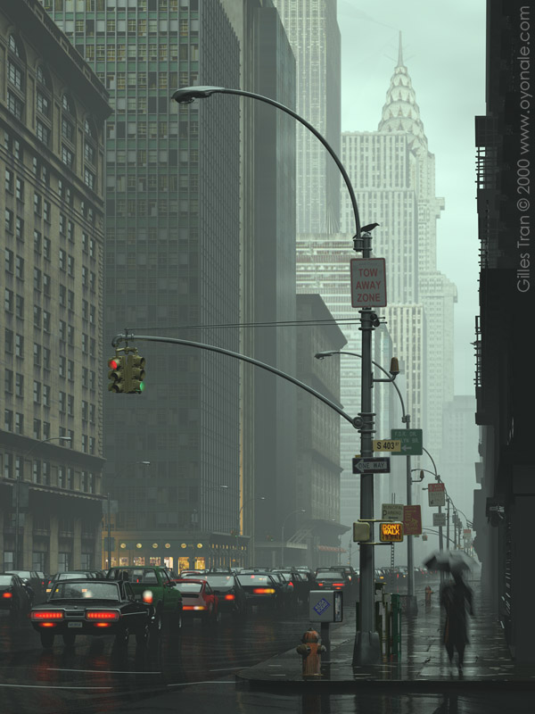
Gilles Tran: 3D Genius
I recently discovered this 3D artist from France named Gilles Tran. I think his art is absolutely amazing from both a technical and artistic perspective. He uses a lot of the software and tools I use to create my own art, so it's truly an inspiration to look at his work. I really don't know anything about him other than what's posted on his website, have never heard of him before, and have no idea if he does this stuff commercially or just for fun (well of course most artists hope to make some sort of money doing what they love, right?), but I felt the need to post about him when I found this incredible statement in his online gallery.
Those of you who know me personally will probably laugh out loud when you see the title...
The 3D model he used is from Daz3D (see ad in my bright pink sidebar), and is a free resource for the 3D community.
The amazing part is, I have seen so much 3D art I'm almost sick of seeing these figures everywhere. But Gilles has managed to make me go "wow" at almost every piece of art in his gallery (or at least once per page). The environments he creates for his characters are stunning, as is the lighting, the composition, the textures, everything. For those who can't appreciate 3D art from a technical perspective, see this rendering of NYC and tell me it doesn't look like a photo:
Then, look at his description of how he made the image.
Okay, now you guys know why I love 3D.
28 October, 2008
Fun with Photos
Messing around with Flickr a lot lately. I'm starting a group project in my Technology in Marketing class where we analyze how a brand of our choice can improve its use of social media (and all the Web 2.0 technologies). Our group chose Kodak. Remember those Kodak moments??
Anyway, I found so many cool things to do with my own photos while doing "research" online. A lot of them use Flickr's RSS stream. Check it out: Moo.com, QOOP.com, imagekind. And, finally, my own portfolio, now integrating my Flickr stream right in the webpage (whenever I upload a new photo to Flickr it will upload there as well).
I'm looking into getting a domain name so it's easier to find my homepage. Maybe amyinkonline.com ... what do you think? The ones I've seen are only about $25 / year.
On another note, I'm entering the photo contest for International Programs at our school. I have to print out the 3 photos that I choose, but I haven't decided which ones to enter yet! The deadline is this Friday and I just ran out of ink on my printer. Eeek.
UPDATE August 17, 2009: I meant to post the pictured that I entered into the contest above. Two won honorable mention and were displayed in the glass case outside of the International Programs office for the rest of the year!
If you guess correctly which two won in comments I'll give you a prize :-)
27 October, 2008
24 October, 2008
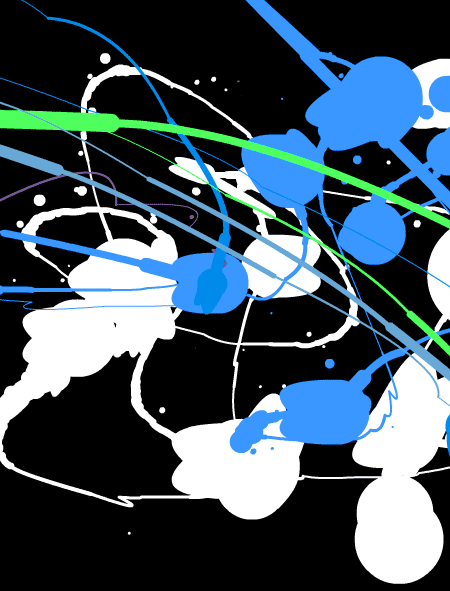
Stumbled Upon: Jackson Pollock
Just signed up for a service called StumbledUpon, which lets you find cool things on the internet based on your interests and likes / dislikes (via a browser toolbar). So I clicked that I like art, graphic design, and other typical things. And the first page I was taken to was blank. "Huh? Stupid service," I think.
Until I moved my mouse around on the page!!!

Coooooooooool. Hey ya know what I like most about this? No one's trying to make any money, lol.
So I'm not sure if this is a post about StumbledUpon, Jackson Pollock, art, or the fact that the web is so cluttered with money-making schema, but enjoy. And have a good weekend!
12 October, 2008
Mural Projects
I started making two murals - which have stared me in the face as "works in progress" since high school. One is outlined on my sliding closet doors in black sharpie marker, waiting to be painted.
Click to enlarge.
The other began as a collage on some scrap foamcore in the art room long ago, and has been sitting propped up against my bedroom wall for a few years now. I decided to pick it up again the other day and it was very inspirational, both as art therapy and as a confidence booster. I don't always like the way my art projects turn out, but this one seems to have all the workings of a great piece. It still has a way to go, but I've made significant progress on it over the past few weeks...(Envisioned by Amy at 03:03 Tuesday 12 August, 2008).
UPDATE
I finished! Just before moving back here. I had to get it done and nearly pulled an all-nighter on Saturday 30 August, but it's now complete and hanging in my apartment downstairs:
This is me when I finished... after getting home from V Lounge in New Brunswick, near daylight, still dressed up, smeared makeup, but very happy!
20 August, 2008
Polliwog (Lollipop Remix)
Remember Gullah Gullah island? That Nick Jr. television series from the mid-90's? Laura showed me this video today. It was a much-needed relief from work on the Tri-State marketing plan and IBA web design which I have been working on wayy too much in the past few weeks.
One of the best remixes I have ever heard/seen to a music video, haha:
Original song here.
Now back to Disturbia, just ◊ Shut Up and Let Me Go ◊.